LO2: Redesign of their stock manager
Summary
- Eliminated manual workflow, team migrated from Excel + Google Drive to a unified platform.
- Reduced search time by removing 3 redundant navigation layers.
- Tag system simplified from 3 categories with N subcategories to single-search + autocomplete.
- Design system built with auto-layout (CSS flexbox behavior) for zero-breakage scalability.
- Conflicts between departments down 90%, productivity up 100%, proposals 60% faster.
- Beta launched with positive team adoption: “a tool we finally want to use”.
The starting point
I was brought in to redesign a stock management platform for an interior design company. The tool had to handle image-based product searches, inventory tracking, and different user roles. The real issue was that the old interface was so clunky and hard to use that employees completely bypassed it. They were actually using a mix of Excel and Google Drive, manually copying image filenames to reference products in their reports. My job was to fix a severe usability problem.
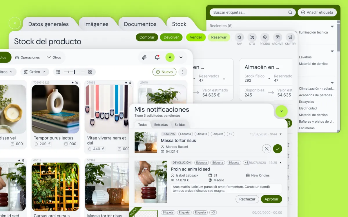
Limits
This project came with a few tough realities I had to design around.
- I could not access the live platform because of client security rules, so I only had static screenshots to work from.
- The clients were too busy to be involved in a standard design process.
- The budget did not allow for complex interactive prototyping.
Research
During the first meetings with the department heads, I looked at the old screenshots and asked them about specific elements and flows. They could not explain what some parts of the interface were supposed to do. That was a turning point for me. I realized we did not just need a nicer looking version of what they had. The old app was bloated with redundant features and we needed to cut out the noise.
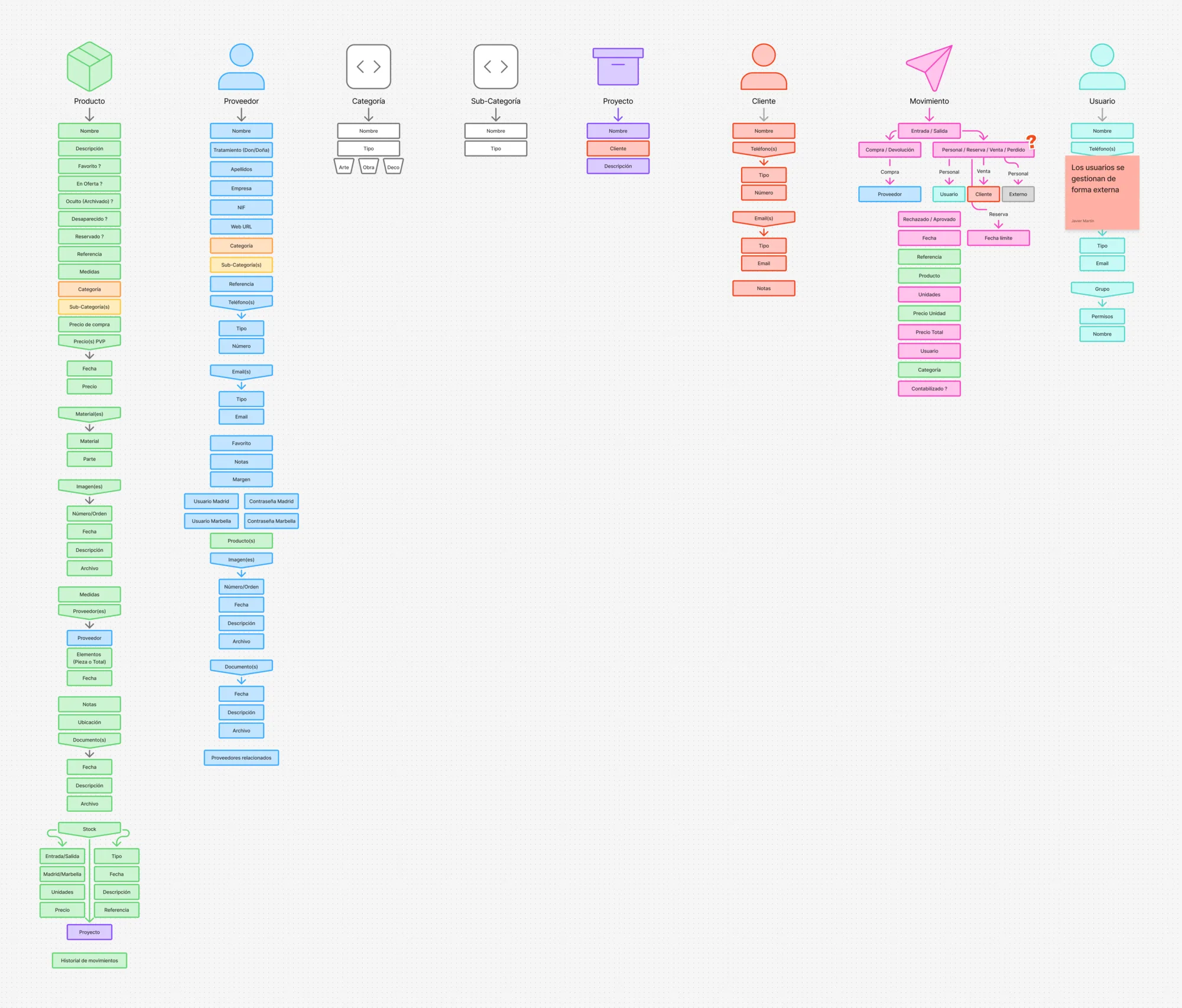
To get a grip on the data, I took a step back from screens and did a few things that ended up driving the whole project.
Design
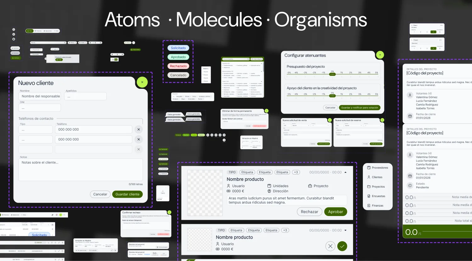
For the actual UI, I built a robust design system in Figma using autolayout to mimic CSS flexbox behavior.
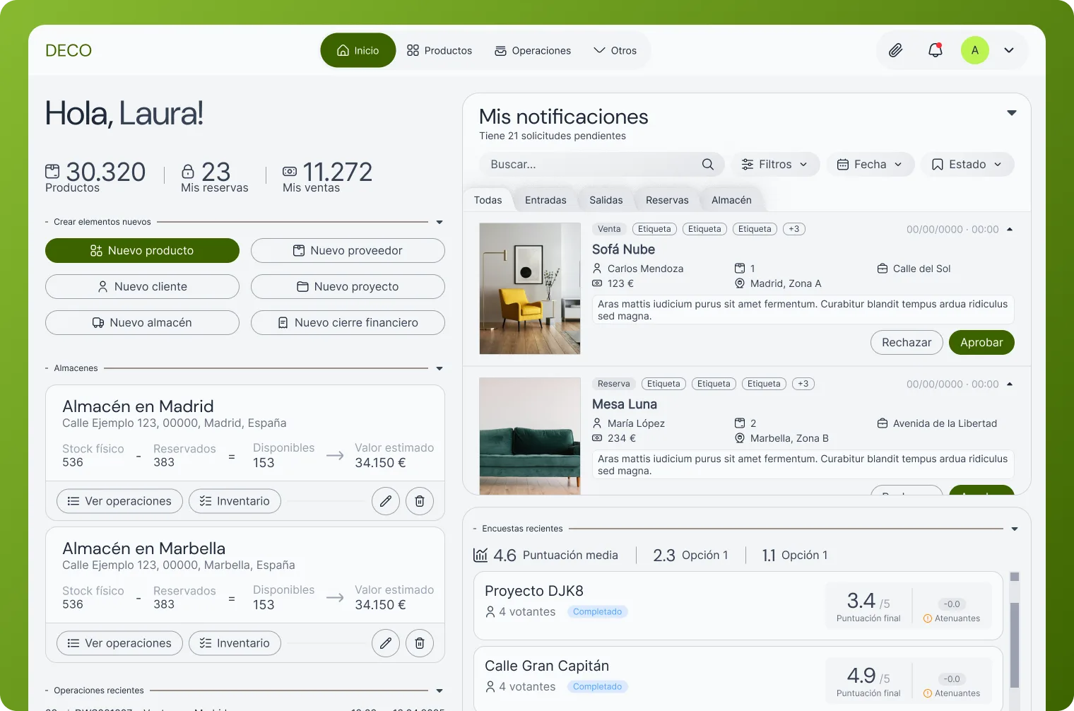
To keep the interface consistent across 40+ screens, I built a design system from scratch. Semantic color tokens for SLA states (green for on-time, amber for warning, red for overdue). Component library with data tables, filters, modals, and form elements. A developer could grab any component and know exactly how it behaves. When a new warehouse flow was added later, it took a day instead of a week.
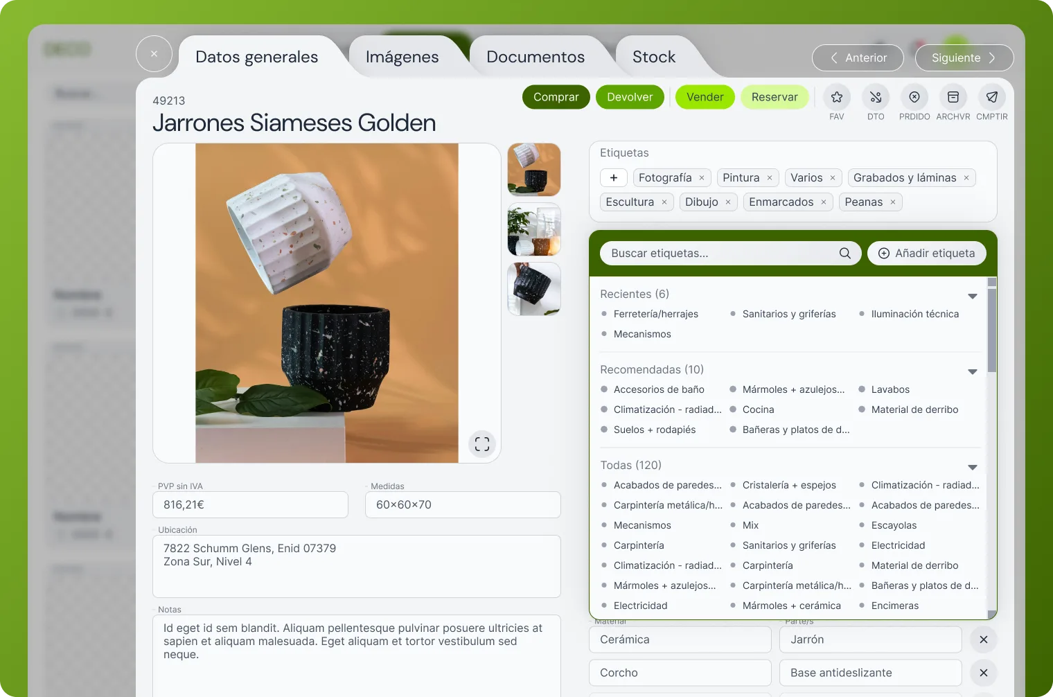
Later during sprints the client pointed out their complex and redundant tag system, in which they had 3 categories and N subcategories inside each with empty, deprecated and duplicated tags. I proposed re-building the tag system from the ground up with a search box and an array of the selected tags.
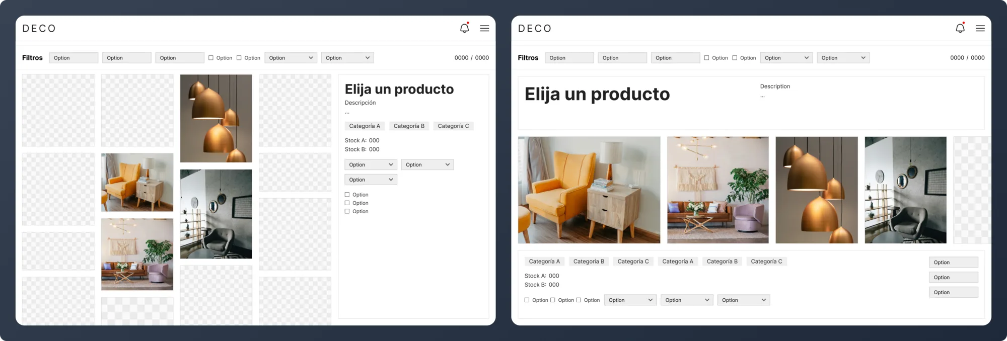
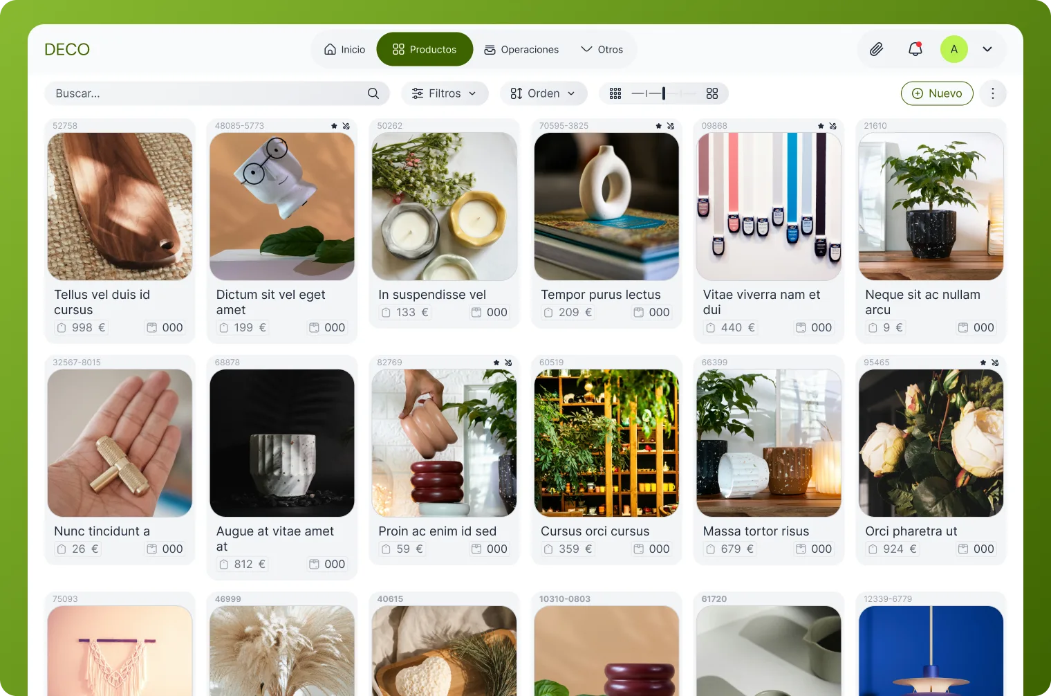
There was an interesting challenge regarding the main product grid. The initial direction was to use a masonry layout like Pinterest. I pushed back on this based on my own experience as an artist using Pinterest daily. A masonry layout is great for inspiration but terrible for productivity. It is chaotic and makes it easy to lose track of specific items. Knowing how front-end development works, I also knew that building a responsive, sortable masonry grid is a massive headache to maintain. I documented my position, but the decision was made to try the masonry approach anyway. A month into development, the exact sorting and scaling issues I warned about appeared, and we ended up switching to the standard grid I had originally proposed. It was a good lesson in documenting the reasoning behind design decisions so the reality check is clear when things hit development.
The end
After the redesign went live, the team measured clear improvements:
- Conflicts between departments reduced by 90%, since everyone now works from the same source of truth.
- Productivity increased by 100% by concentrating all the work in a single platform.
- Proposals are created 60% faster than with the old spreadsheet workflow.
When I presented the final design internally at the client’s company, the response was very positive. People actually applauded and said it looked like a tool they would finally want to use. The project is currently still in beta.
If I were to start this over, I would change a few things.
- I would ask the clients for baseline metrics of how much time they spend on their current Excel workaround before starting anything.
- I would do smaller, more focused moodboards to nail down the visual style earlier.
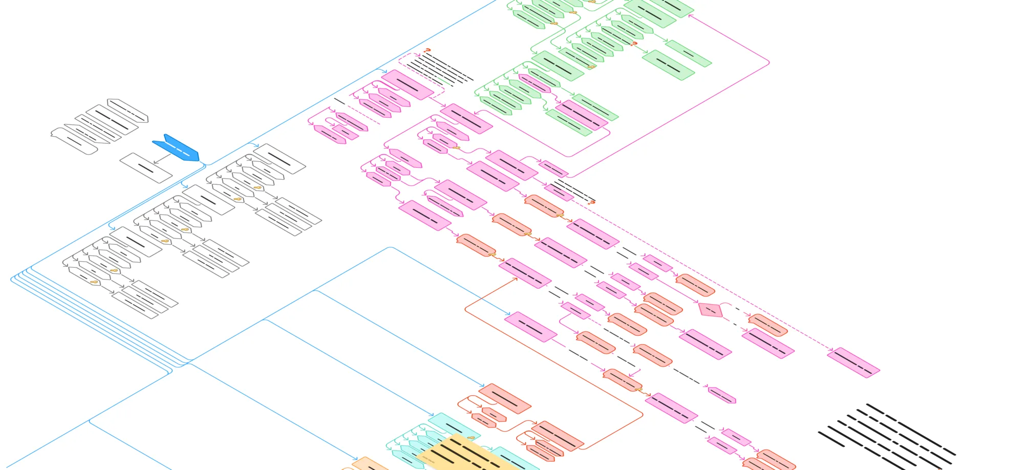
- I learned that on large projects, you cannot design something expecting it to stay exactly the same. You have to design for surprises. That incredibly detailed user flow I made was the only reason we could make changes on the fly during development without losing track of the logic.