Austral: From spreadsheets to a custom SaaS
Summary
- 90% reduction in errors and 50% faster reviews.
- Went from a clunky, overloaded Excel workflow to a tool that unifies and automates everything.
- Very detailed wireframing that let the dev team keep building before the UI was validated.
- Atomic design system built for modularity, scalability and last-minute changes.
The starting point
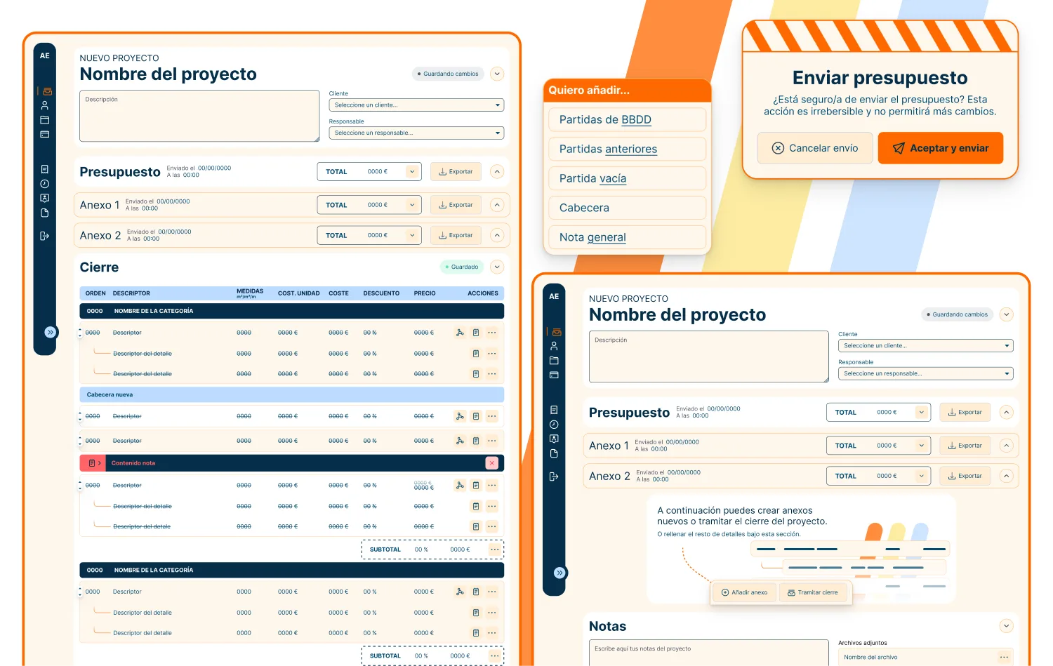
Austral is a construction company that managed every part of their business on Excel. Budgets, accounting, personnel, project tracking. All of it lived across dozens of disconnected sheets. As they grew, the cracks got wider. Inconsistent data between employees, constant errors and no reliable way to share or track information.
I came in as a Product Designer and Quality Control lead for roughly 6 months. The brief was simple on the surface: build a SaaS that does everything those spreadsheets did, but better.
Limits
The client couldn’t dedicate as much time to the project as others. Running a construction company doesn’t leave much room for long feedback loops or structured design meetings. Every conversation had to count.
On top of that, each Excel sheet had its own logic and format. There was no single source of truth to start from, so I had to map out all the inconsistencies before I could design a solution that actually covered their needs.
Process and decisions
I started by making sure we had a text document as the single source of truth. From there I built a very detailed wireframe, simplified and thorough. The client didn’t put much emphasis on aesthetics, so I focused my energy where it mattered most: usability and structure.
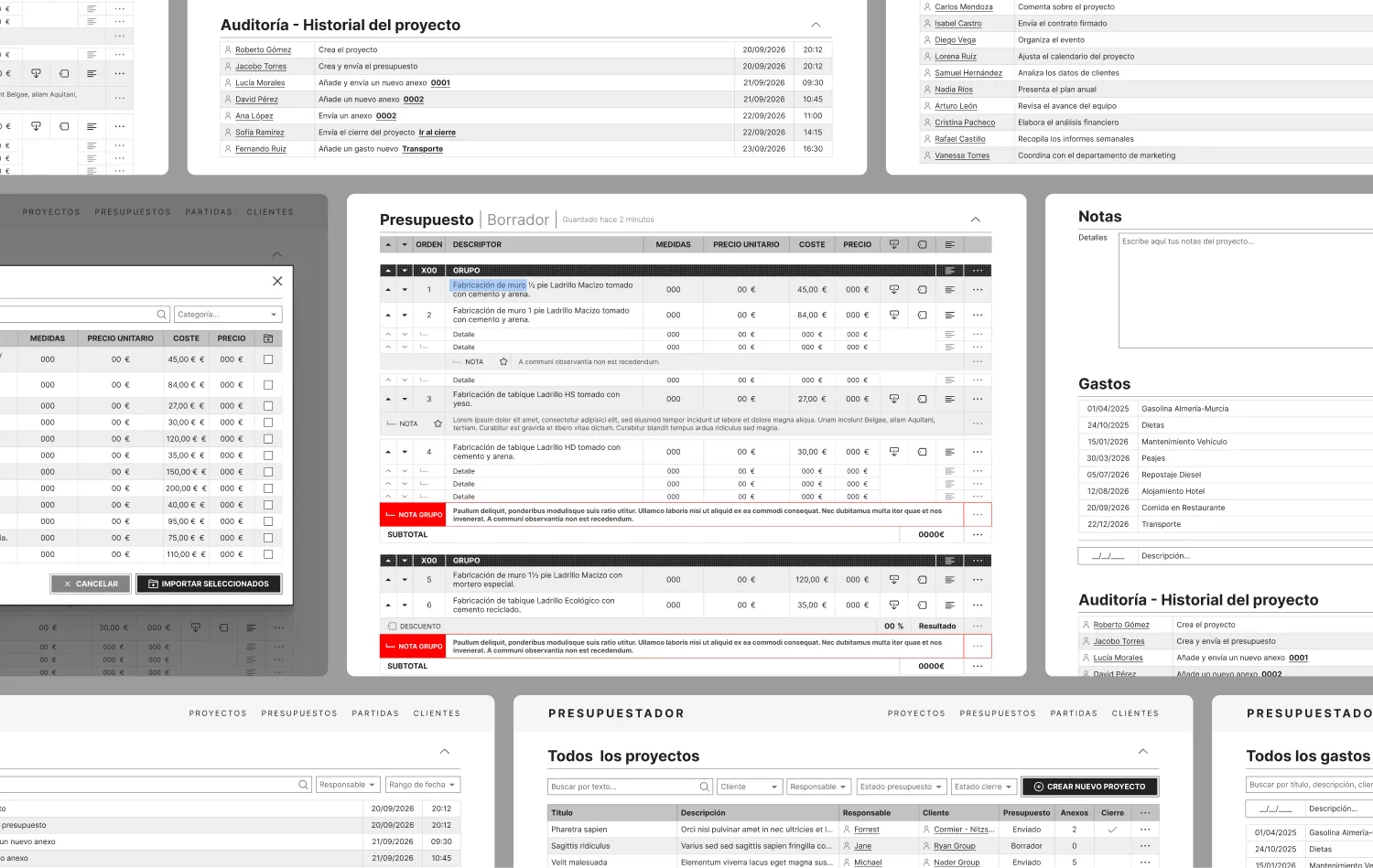
Every component had to be modular and replicable. The interface could change completely from one sprint to the next, and the design system had to handle that without breaking. I built everything with atomic design principles so the dev team could swap, add, or remove pieces without redoing entire screens.
Something curious is that in this project I started getting interested in ‘web components’ and frameworks like Astro, which work like Figma components (pieces of the web I can reuse as templates). In short, I got better as both a designer and a developer.
I’ve learned the hard way that an unavailable client can shift scope between meetings. Designing for that reality meant the dev team could keep moving without me, and I could design without wasting time on things that would get thrown out anyway.
We collaborated closely throughout the whole process. I used every meeting with the client to resolve accumulated questions, get feedback and refine that document I mentioned at the start, the source of truth. With development, the wireframes served as a constant reference point to confirm what was feasible before investing time in high-fidelity UI. And just like with the LO2 project and its user flow, having something so complex but conceptual at the start made us stumble into small gaps and logic conflicts.
Craft and execution
The consistency across screens is what I’m most proud of. Tooltips, scalable components, small usability details that make the daily workflow feel smooth.
The biggest challenge was obvious from the start: don’t rebuild Excel, or at least only bring over the good parts. The tool needed to feel fluid and efficient, but without bringing back the same problems the old sheets had. All the data still lived in tables, that was unavoidable, so I designed multiple cell types with different states and contexts to make those tables actually work for the user. I made variants for editable cells, read-only states, selection modes and contextual actions.
For interactions, I kept micro-animations focused on usability. Things like guiding the eye to an error state or highlighting a component that just made a big change to the project.
Results and impact
Errors dropped by 90%. Review time was cut by 50%.
Employees said they appreciated having a tool that felt familiar coming from spreadsheets but fixed all the pain points they’d been dealing with.
The dev team was another win. All that time invested in wireframing up front meant they could build without waiting for UI approvals on every decision. The design system made sure nothing fell through the cracks when the scope shifted.
Reflection
If I could go back, I wouldn’t underestimate how much valuable information the client was sitting on. I don’t blame them. Everyone’s busy, and changes happen. But I’ve learned to read clients better and extract that knowledge earlier.
The skill I’m taking from this project is the ability to organize a huge amount of information in a way that actually helps the client. Austral needed structure, not just a better looking spreadsheet.