Disconnected: UI and landing page for an indie game
Summary;
- Pivoted from 2D artist to UI lead after test work exceeded expectations. First Unreal Engine project.
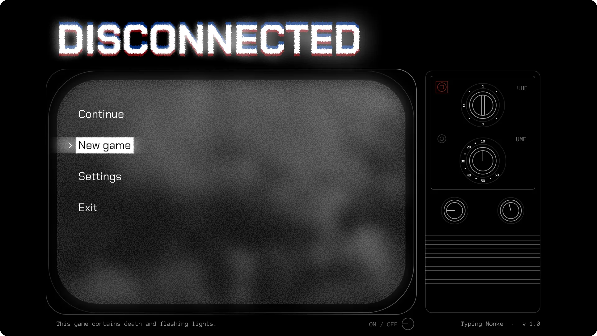
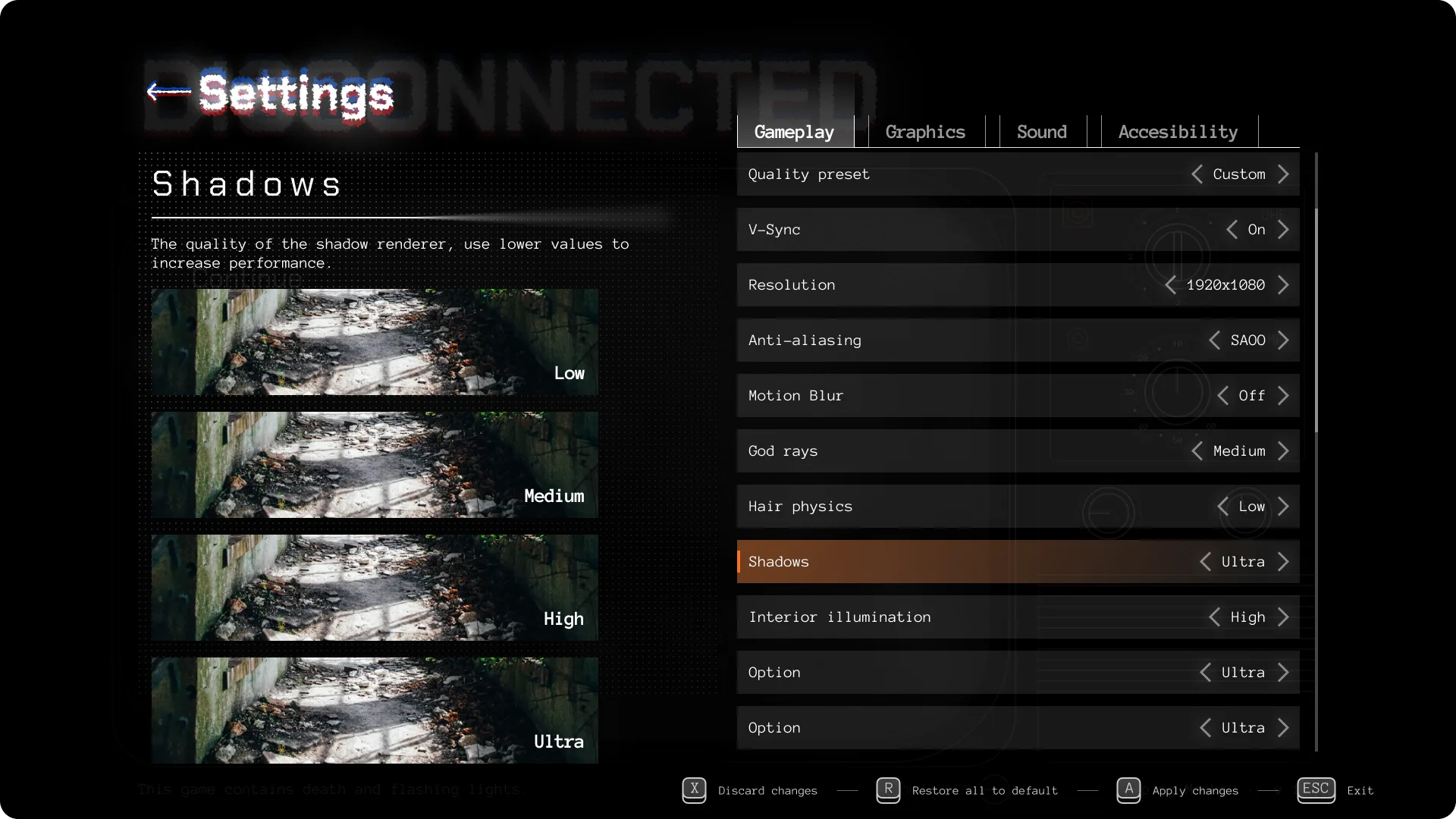
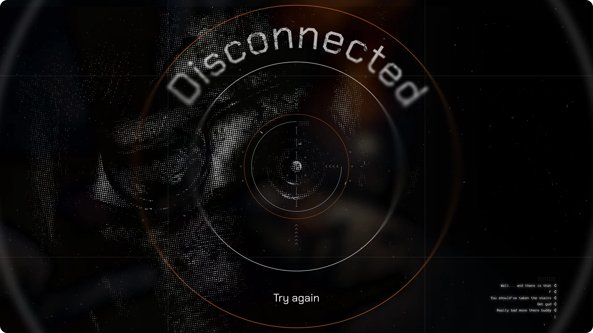
- Designed in-game smartphone interface with a cohesive design system spanning menus, phone UI, and landing page.
- Simplified app grid and iconography based on gameplay recordings, improving reaction times during chase sequences.
You’ve got mail!
The studio brought me on as a 2D artist but moved me to UI design after seeing my test work. It was my first time using Unreal Engine and the main challenge was creating a smartphone interface that looks good when rendered in a 3D desktop environment.
Mission
I had to design a functional in-game mobile system and a teaser website. The goal was to make the UI legible on the game engine and create a marketing page that attracts players without ruining key story moments.
Design
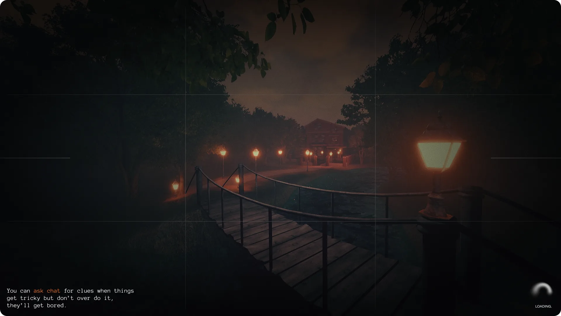
I researched how interfaces render inside Unreal Engine, studying games like GTA V to see how a 3D phone looks on a desktop screen. This required breaking some standard mobile usability patterns to ensure elements remained readable at odd angles and during movement. I built a small design system to keep the menus, in-game phone, and landing page cohesive.
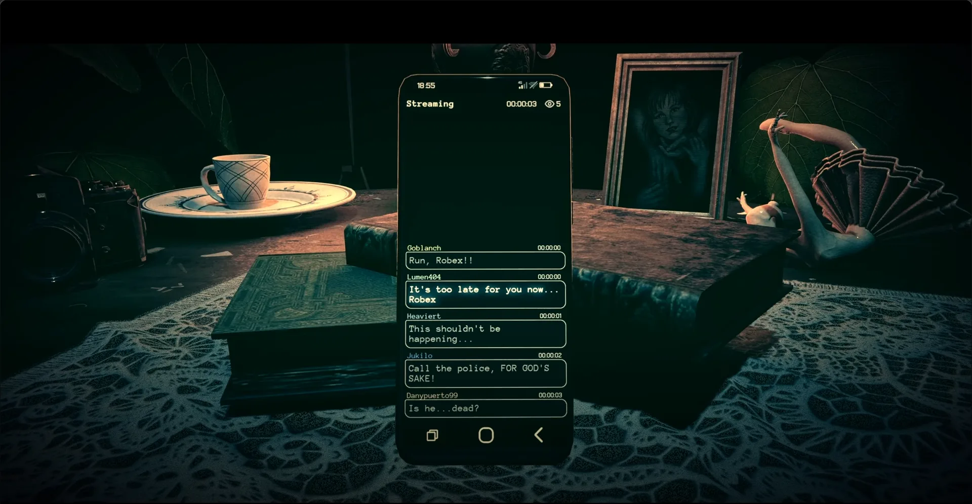
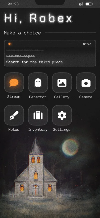
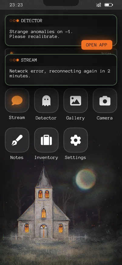
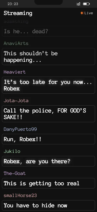
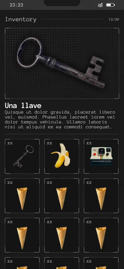
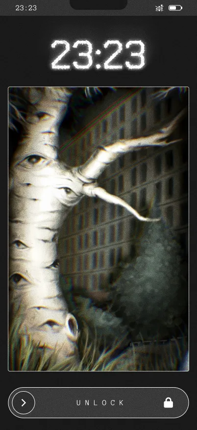
Through gameplay recordings, I realized some icons were hard to distinguish and the app grid was frustrating to use during chase scenes, so I simplified the layout to improve reaction times.
For the landing page, I made the decision to remove the main villain. While standard marketing suggests showing the best assets, I knew revealing him too early would ruin the experience, so I focused the design on building mystery and intrigue instead.
Watch the landing live here!
The end
We are currently preparing the demo for events like Guadalindie and looking for a publisher. The collaboration with the team was excellent and we are already looking for opportunities to work together again.
I realized that designing changes a lot when you are a potential user of the product. This taught me to separate my personal taste from the needs of the target audience, focusing on true empathy rather than just designing what I would want for myself.