PsyTrack: Scheduling and patient management for psychology practices.
Summary
- Replaced fragmented tooling (calendars + Excel + WhatsApp) with a single mobile app.
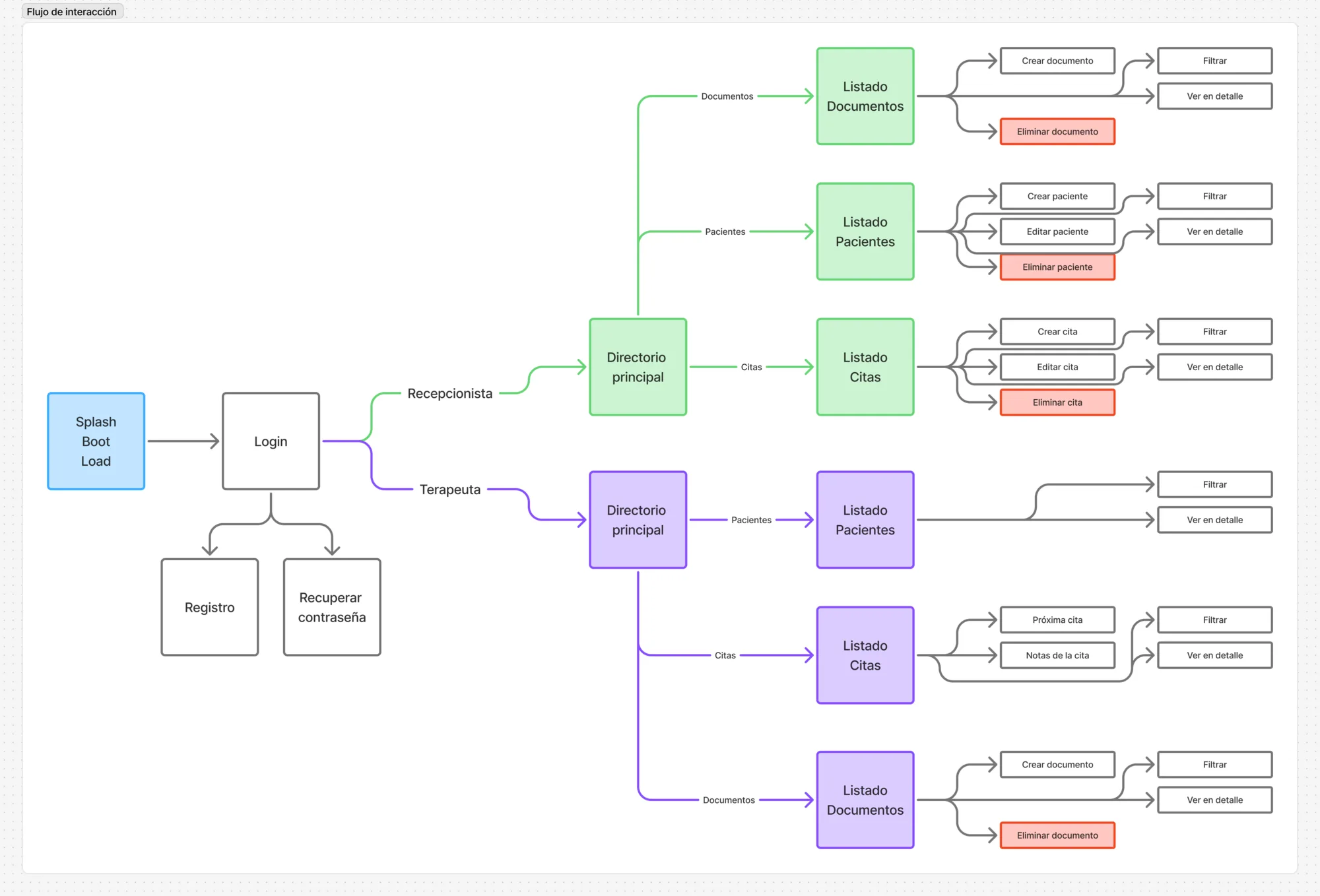
- Two-sided interface designed for psychologists and secretaries within the same practice.
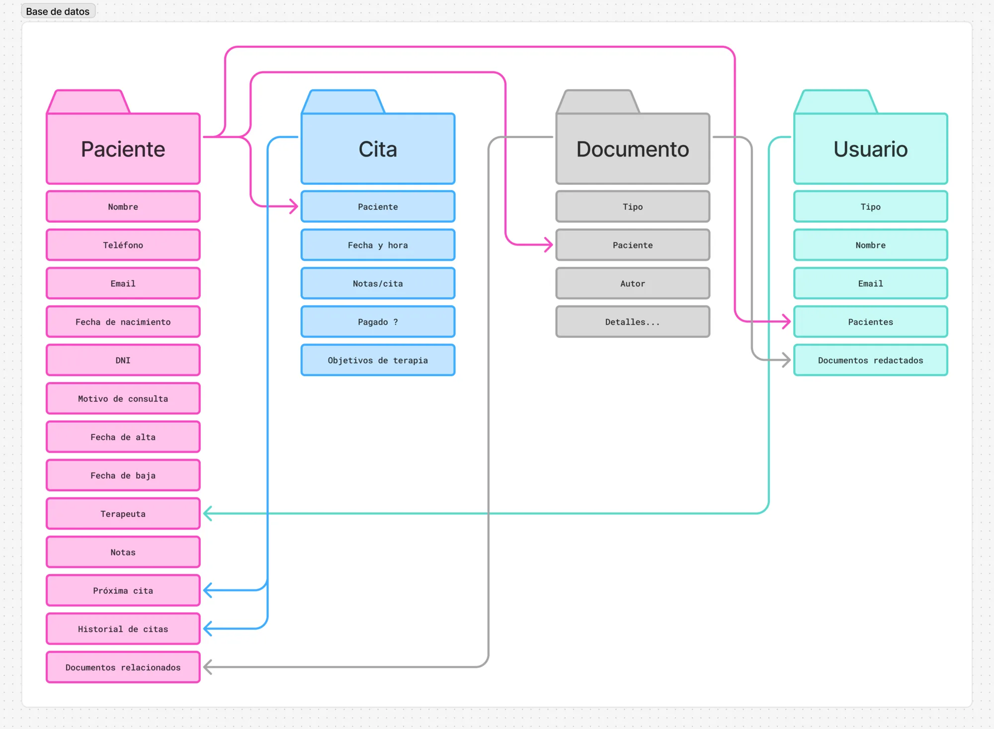
- Object model and data architecture built before any UI to map patients, appointments and team interactions.
- Component system with scalable elements like patient cards, ready to evolve with user testing.
- Mobile-only decision driven by encouraging digital disconnection for healthcare professionals.
- Friction reduced by 70%, interdepartmental communication improved by 80%.
The problem
PsyTrack is a management app for psychology practices. I was brought in as a freelance Product Designer to help with ideation, research, design and product strategy.
The team was managing everything through separate tools: calendars, spreadsheets and WhatsApp. The bigger the workload, the faster things broke down. Secretaries struggled to keep everything synchronized, and there was no scalable way to handle growth.
This came directly from the stakeholder. During conceptualization I found deeper issues at the data level: how patients, appointments and team members connected across the system.
The app would be used by two sides of the same practice: psychologists and secretaries. All decisions traveled through a single developer and the main stakeholder. The development team was one person, so every feature had to be prioritized by impact and feasibility.
Process and decisions
I started by researching similar platforms like ClickUp, Monday and Asana. Then I built an object model to map every element in the application and how they interacted. After that, a user flow, and finally the interface design.
I considered a desktop version but ruled it out. The goal was to encourage digital disconnection for the users, which is important in this field and one of the main pain points. A mobile-first approach made more sense.
I collaborated closely with development to validate each feature. Since this was Android, my web frontend knowledge didn’t always translate directly, so those conversations were essential to avoid building something that looked right but felt wrong on the platform.
Nothing changed from initial idea to final product. The scope was clear from the start.
Craft and execution
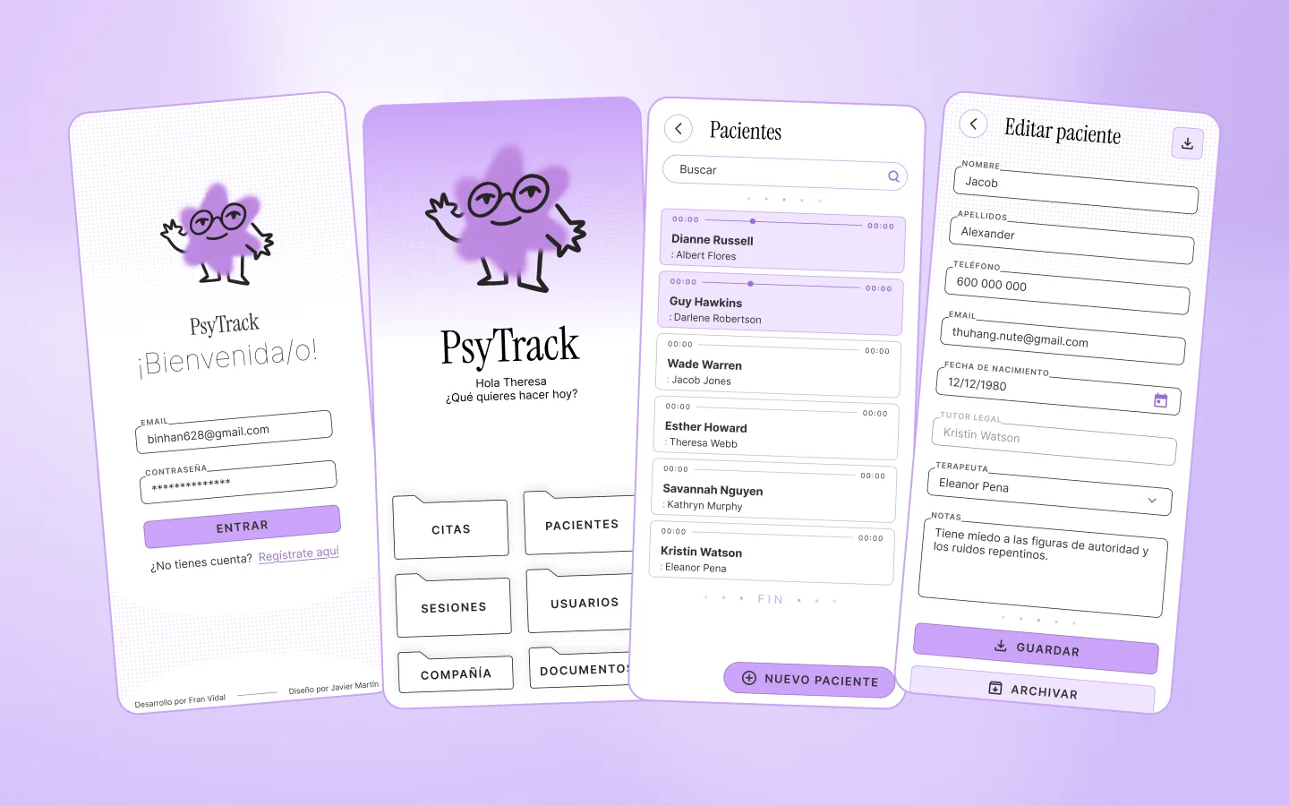
I’m happy with how the overall identity turned out: pastel colors, a friendly mascot and vintage paper-like elements. It felt warm and approachable, which matters for an app used daily in a healthcare context.
The hardest problem was the calendar. Making appointments, time slots and team schedules readable on a small screen without overwhelming the user took the most iteration.
I built a component system for elements with high scalability or uncertainty. The patient card, for example, was designed to evolve. After usability testing, new needs surface that only someone with field experience can anticipate.
The mascot was designed to be animated during onboarding and highly customizable. The product also has a third branch planned for patients, which will lean more into animation and less into functionality by nature of its scope.
Results and impact
Friction dropped by 70% and interdepartmental communication improved by 80%. Other practices showed interest in acquiring an adapted version of the app, which is why scalability was a priority from the beginning.
Users responded positively. The relief of leaving bad practices behind was the most common feedback. Stakeholders saw a clear future for the product beyond the initial scope.
The project is currently on standby but planned to continue in 2026. The design system and data architecture are in place for that next phase.
Reflection
Some usability improvements were left behind due to complexity. I would have liked to anticipate that earlier and propose simpler alternatives instead of postponing them.
The most relevant skill for my next role: communicating with development to prioritize the right features and find easier ways to implement the complex ones.